Place Branding Identity: Architecture and Typography
When branding commercial office buildings, there is often a temptation to rely on what we call “building badging” — creating a symbol that simply mirrors the architecture. A common approach is to design a mark that reflects the physical form of the building itself.
Yet there are occasions when architecture lends itself to a more subtle approach. Instead of creating a separate symbol, typography alone can capture the essence of a place and its architectural identity.
We’ll review three examples of typographic property branding from our Singapore portfolio of real estate brands.
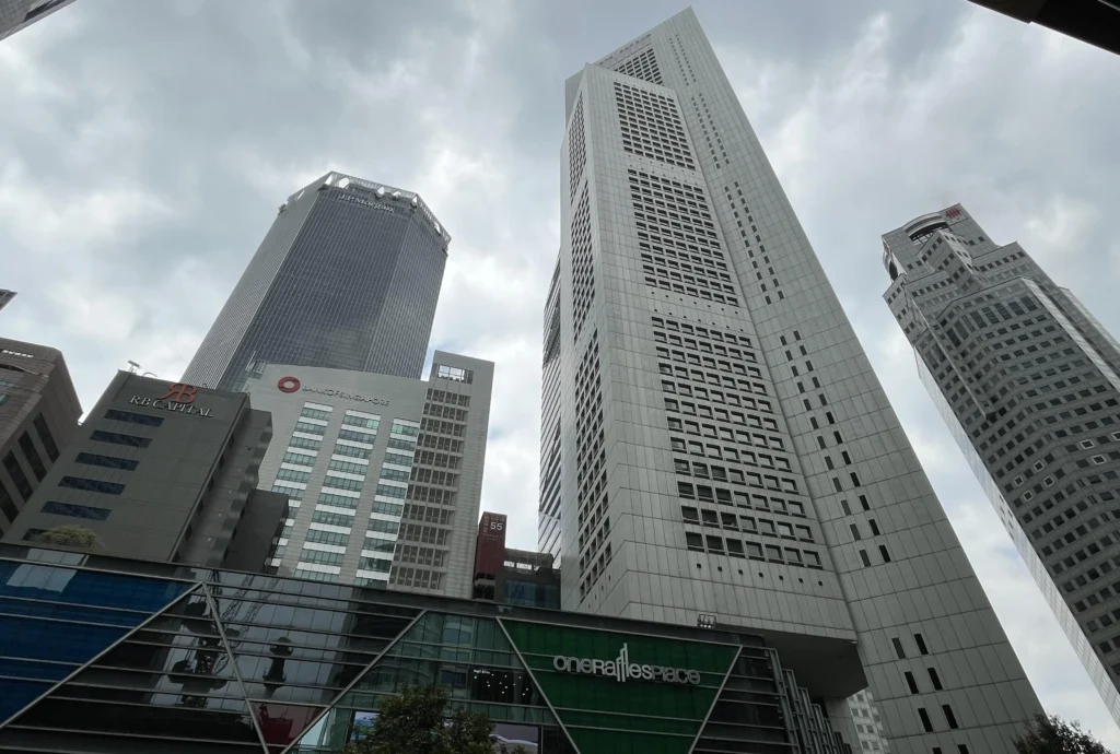
One Raffles Place
The One Business Address
Rising 280 metres above sea level and stretching to 282 metres according to OUE, One Raffles Place sits at the historic heart of Singapore’s business district. With more than 860,000 square feet of lettable space, it has long been one of the city’s most prestigious business addresses.
When completed in 1988, it was the tallest building outside the United States and remains widely regarded by architects as one of the world’s most notable skyscrapers.
A Commanding Presence
One Raffles Place is a brand that commands presence. Starting with the authoritative “one” in its name, the identity draws inspiration directly from the architecture of the twin towers that define Singapore’s CBD skyline.
The original and taller tower was designed by Japanese architect Kenzo Tange and was one of his earliest skyscrapers. Two decades later, the task of complementing this landmark fell to his son, Paul Tange, who took inspiration from his father’s triangular design.
The brand mark pays tribute to this father and son partnership by subtly referencing the twin towers through the double “ff” in the word “Raffles”.
The result is a thoughtful identity that translates architecture into typography. The wordmark uses a clean, modern typeface with a stylised vertical “ff” that echoes the twin towers and their architectural legacy, creating a refined logo that reflects the building’s prominence within Singapore’s skyline.
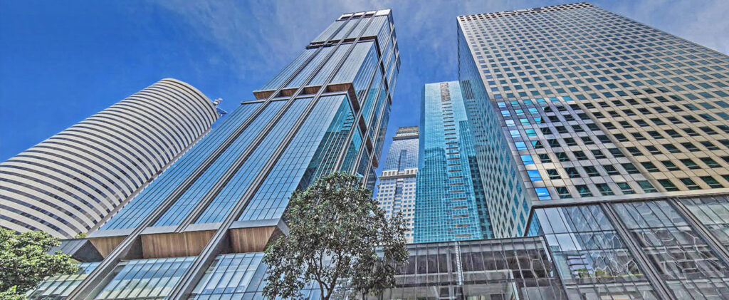
OUE Downtown
A Postal Code of Its Own
OUE Downtown is the new identity for the former DBS Building at 6 Shenton Way. Like One Raffles Place, it comprises two towers built in different eras. Tower One was completed in 1975 and at the time was the tallest building in Singapore at 201 metres. Tower Two followed almost two decades later in 1994, rising to 150 metres.
Originally designed by Architects Team 3, founded in 1967 by Baharuddin Abu Kassim, Lim Chin See and Lim Chong Keat, the development has evolved into a major mixed use landmark comprising offices, serviced residences and retail.
With its 262 metre street frontage, the complex plays a significant role in shaping the emerging work, shop and play environment of Singapore’s downtown core.
Uptown Style, Downtown Attitude
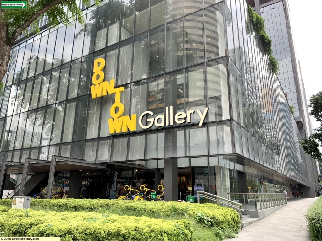
The OUE Downtown identity expresses a confident and contemporary personality. The brand mark reflects the visual language of an urban grid, reinforcing both the sense of place and the meaning behind the name Downtown.
This grid inspired structure also mirrors the rectilinear layout of the development itself. Combined with bold typography and a vibrant colour palette, the identity communicates the dynamic character of this revitalised CBD landmark.
The OUE Downtown logo adopts a fashion forward aesthetic through stacked typography inspired by the structure of an urban grid. The striking yellow colour further strengthens the contemporary identity and ensures the brand stands out within the dense CBD environment.
With its 262-metre retail presence, Downtown Gallery’s bold and unconventional identity almost feels closer to a fashion or streetwear brand, giving it a confident and distinctive voice within the district.
Golden Mile Complex
An Iconic Landmark
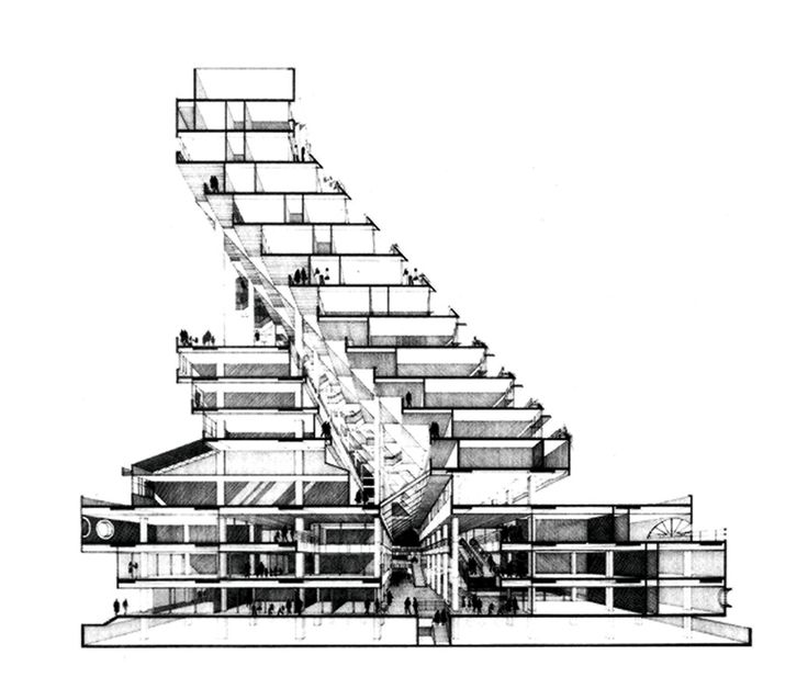
Golden Mile Complex holds a special place in Singapore’s architectural history. When it opened in 1973, it was one of the nation’s first integrated mixed-use developments.
Its distinctive stepped terrace design embodied a bold vision for Singapore’s future and quickly established the building as an iconic landmark.
The project was designed by Design Partnership, now DP Architects, founded in 1967 by pioneering Singapore architects Koh Seow Chuan, Tay Kheng Soon and William Lim Siew Wai. Golden Mile Complex remains one of the most recognisable examples of modernist architecture in Singapore.
Remixed Use Original
Today the Golden Mile occupies a unique position within Singapore’s urban landscape as a rare example of conservation and adaptive reuse. As architect Carl Elefante famously observed, the greenest building is the one that already exists.
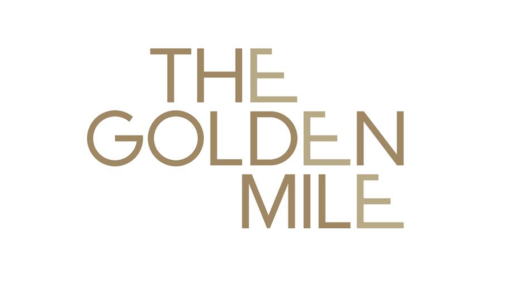
The identity for The Golden Mile pays direct homage to the building’s architecture. The logotype draws inspiration from the iconic stepped terrace facade, sometimes referred to as the building’s “typewriter” profile.
Through a clever manipulation of letterforms, the typography captures the distinctive angle and rhythm of the architecture itself – a creative property branding identity solution that reflects the conservation of this iconic real estate brand.
By embedding the building’s form directly into the typography, the logo becomes more than a name. It becomes a visual tribute to the structure. The result is a clean and contemporary identity that honours the building’s modernist character while celebrating its enduring architectural profile.
When Typography Becomes Architecture
Typography led place branding is not always the obvious solution. The nature of the architecture ultimately shapes the visual narrative and identity of a building.
In some cases, a symbolic badge may still be the most appropriate approach. But when architecture and typography align, the result can create a brand that feels intrinsically connected to the place itself.
References:
https://www.sedgwick-richardson.com/work/breathing-new-life-into-a-historical-landmark-in-singapore/