- 地标品牌建设
- 品牌建设
Masterise Homes
The Rise of a Master
Mastery of excellence
Thao Dien Investments is a real estate developer based in Vietnam with a portfolio of well known residential ‘product’ brands including Masteri, M-One & Millenium. The success of these brands meant that the corporate entity was practically invisible to the market.
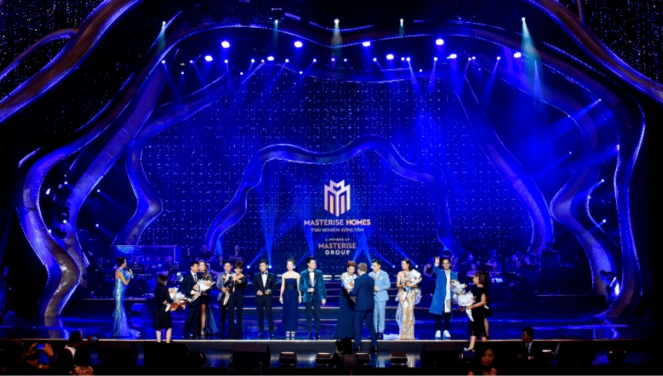
As the business was set to expand beyond residential property into a real estate related ecosystem, an opportunity emerged to position the corporate brand for growth and to launch the brand during the company sponsored annual musical event in HCMC called ‘The Master of Symphony’.
“We enjoyed working with the Sedgwick Richardson team. We appreciate the way they took ownership of developing our new brand. Their team are highly proactive, the time and attention to detail have been incredible. Well done!”
A workshop with the client team served to establish the business insights and to reinforce the focus of the new brand around customer centricity. The tagline ‘Master of Life’ speaks of being in control of one’s life.
Brand identity: the crown
A bold crown-like brand mark with a 3D-feel perspective reinforced the letter ‘M’ in the corporate brand name with a visual sense of authority and leadership. The brand identity was then adapted to the sub-brand Masterise Homes strengthening the corporate brand portfolio.
Brand device: city skyline
Inspired by the visual language of the identity, a graphic device was created in the style of an abstract illustration of a city skyline.


Brand applications
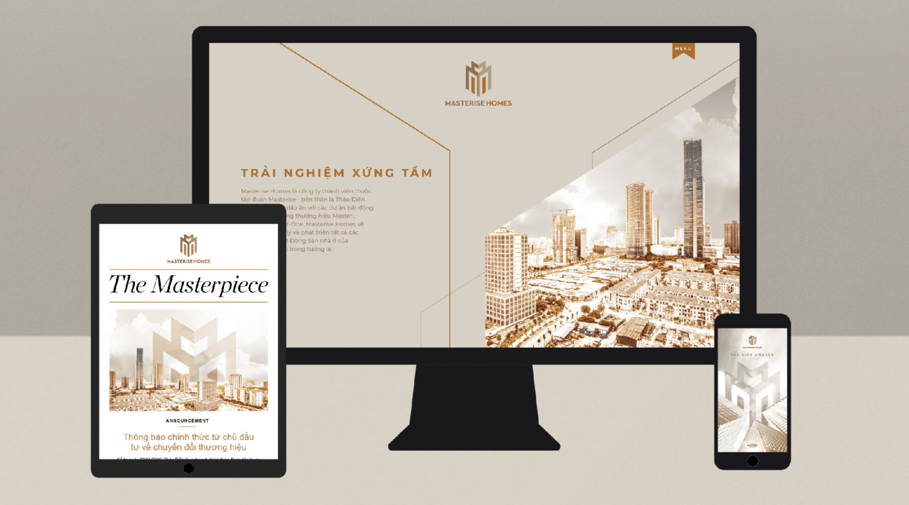
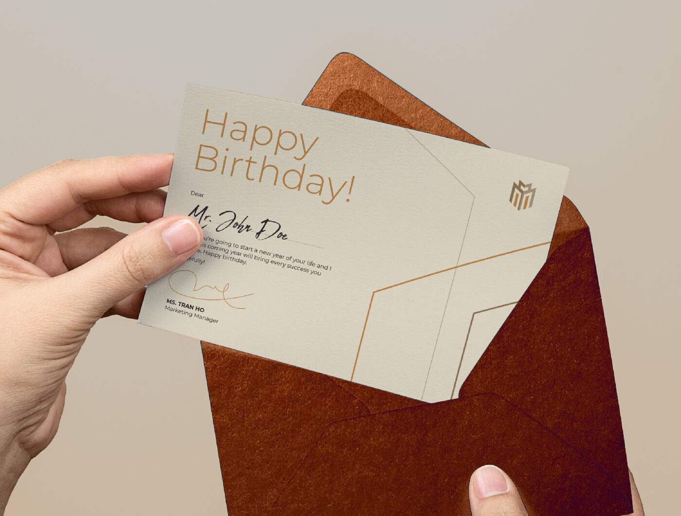
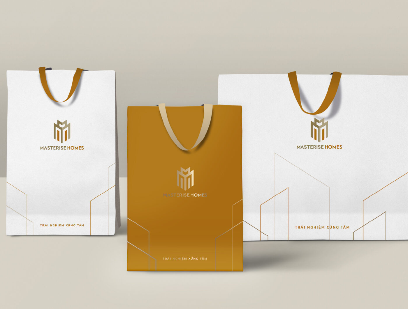
The flexible graphic device was then applied across a set of marketing and communication collaterals and creative touch points building consistency in brand expression.
Photography style
The style of photography emanates a corporate and professional look and feel, varying from visionary cityscapes to lifestyle and portrait shots. The tone of the colours in the style of the images was kept to be warm and homely, to be consistent to the brand’s offering.

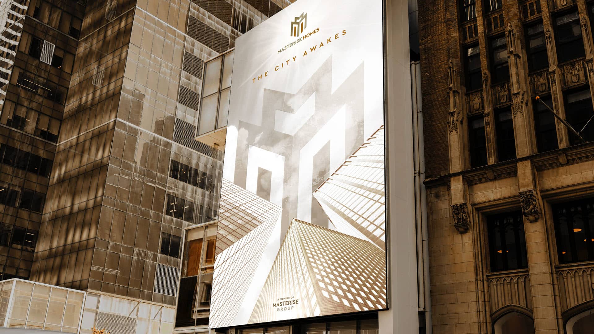
Key visual: a strong brand mark
To communicate the message of ‘rising up’, a compelling key visual was designed, and a communication roadmap was planned for each specific group of stakeholders in a phased approach.
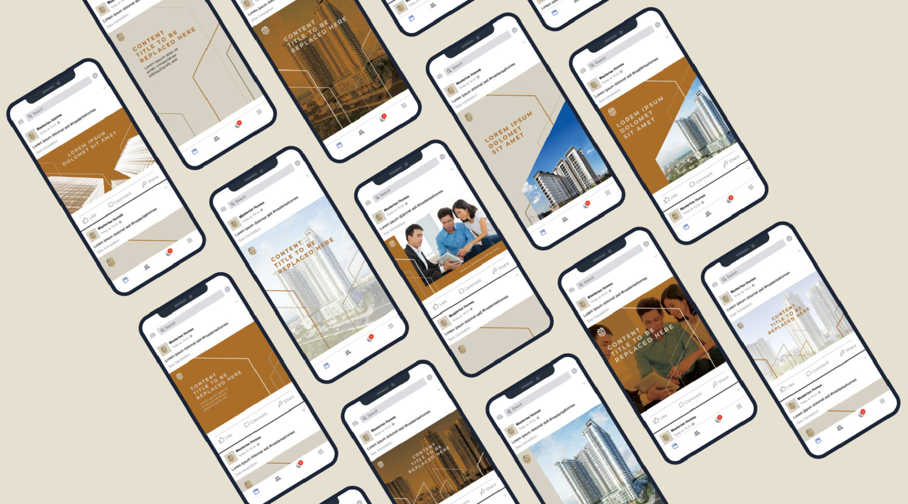
Social media assets & uniform
A dynamic system for social media channels allowed flexibility in content execution and usage.
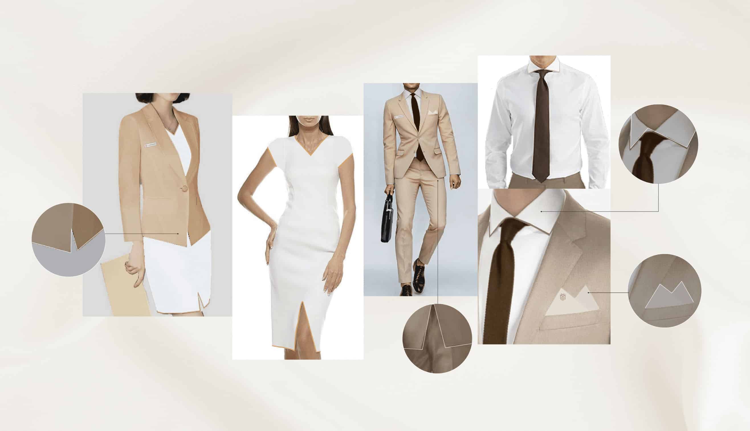
From the men’s sharp-edged suits with a pocket square similar to the M symbol, to the ladies’ dress with a subtle M-like slit, the uniforms were designed to depict Masterise’ as a corporate and professional place of work, with fine details that points back to the masterbrand.
Brand guidelines document
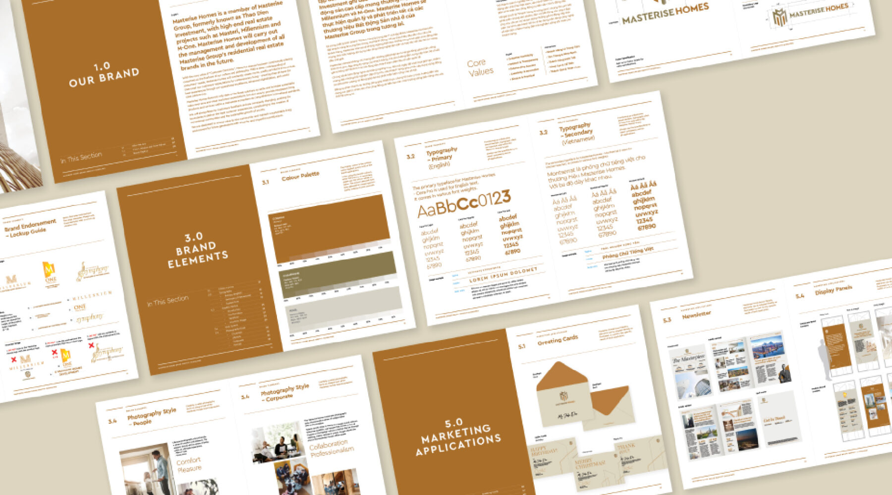
To help the management of the corporate brands, two comprehensive brand guideline documents were created, one for the main brand, Masterise Group, and another for its sub-brand, Masterise Homes.
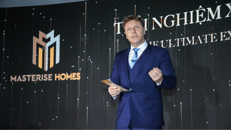
The brand was successfully launched in the Master of Symphony event, and was well received by the management and the peers of Masterise Group.
