- 品牌建设
- 体验
- 策略
Energy Market Company
Power On
Recharging a market infrastructure brand in Singapore’s evolving energy landscape.
The Energy Market Company (EMC) operates Singapore’s wholesale electricity market. Its brand identity dated back to 2003 and the EMC brand guidelines were over 15 years old. Recently acquired by SGX, the time had come to revitalise the EMC brand as the organisation focused on a new business strategy, one of expanding into related areas such as LNG gas and creating a retail platform alongside its core wholesale electricity market.
Having worked with SGX for a number of years on a range of branding assignments, our Singapore team was entrusted with re-energising the EMC brand.
“EMC’s original brand identity system was developed more than a decade ago, when the company was first set up in 2003. It comprised mostly graphic elements that were no longer applied in communicating the brand.
The overarching intent of the EMC branding initiative was really to have a fresh set of guidelines and applications that reflect the company’s new business strategies amid a rapidly changing energy landscape. The Sedgwick Richardson team delivered on this and provided detailed guidance in implementing our brand.”
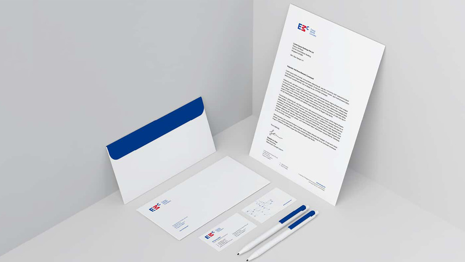
Our solution was not a rebrand. Both the brand name and the existing logo were still perfectly relevant. What was required was the rebuilding of the brand identity around the EMC logo. This provided an opportunity to re-define the EMC’s brand story and its brand personality, and to create an integrated brand identity system so that the new EMC brand guidelines could power on for another 15 years.
Brand Positioning
We started the journey by mapping out three potential brand positioning territories. From a ‘Reliable Partner’ to an ‘Innovator’ and a ‘Pioneer of the Future’, we expressed each positioning territory with a simple statement and visualised each brand personality through conceptual imagery and a visual language. Engaging the EMC senior leadership through this spectrum of positioning territories, we helped calibrate the EMC Brand Story.

Brand identity
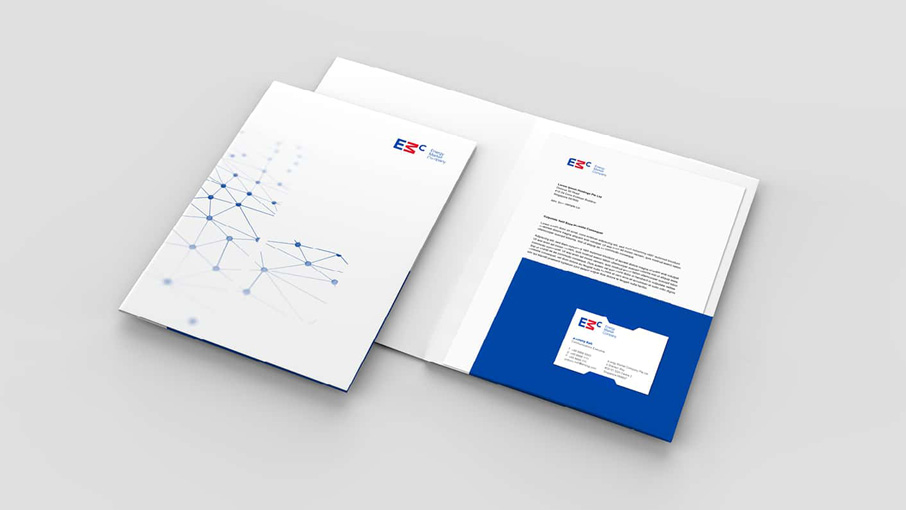
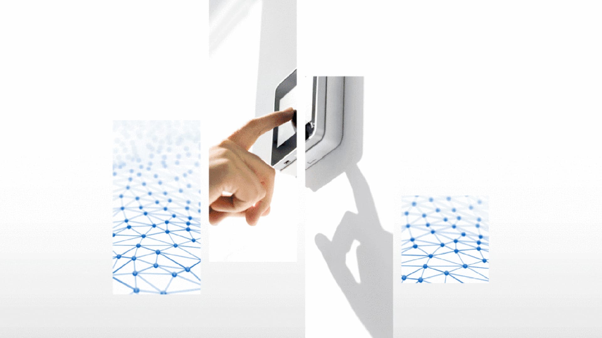
A brand identity system was then developed using a flexible graphic device. ‘Energy Bars’ helped complement the brand logo with the ability to mask imagery and served to unify brand applications.
We complemented the brand identity with a clean and future-facing photography style for both metaphorical objects as well as people. This helped evolve the brand story, making EMC appear more human, professional and future-focused which will increase its appeal in B2B markets as a result.

Branded information design
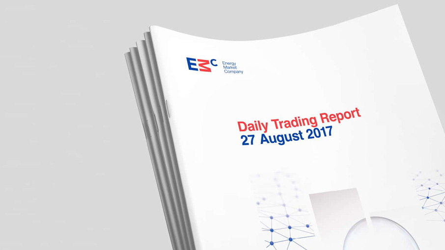
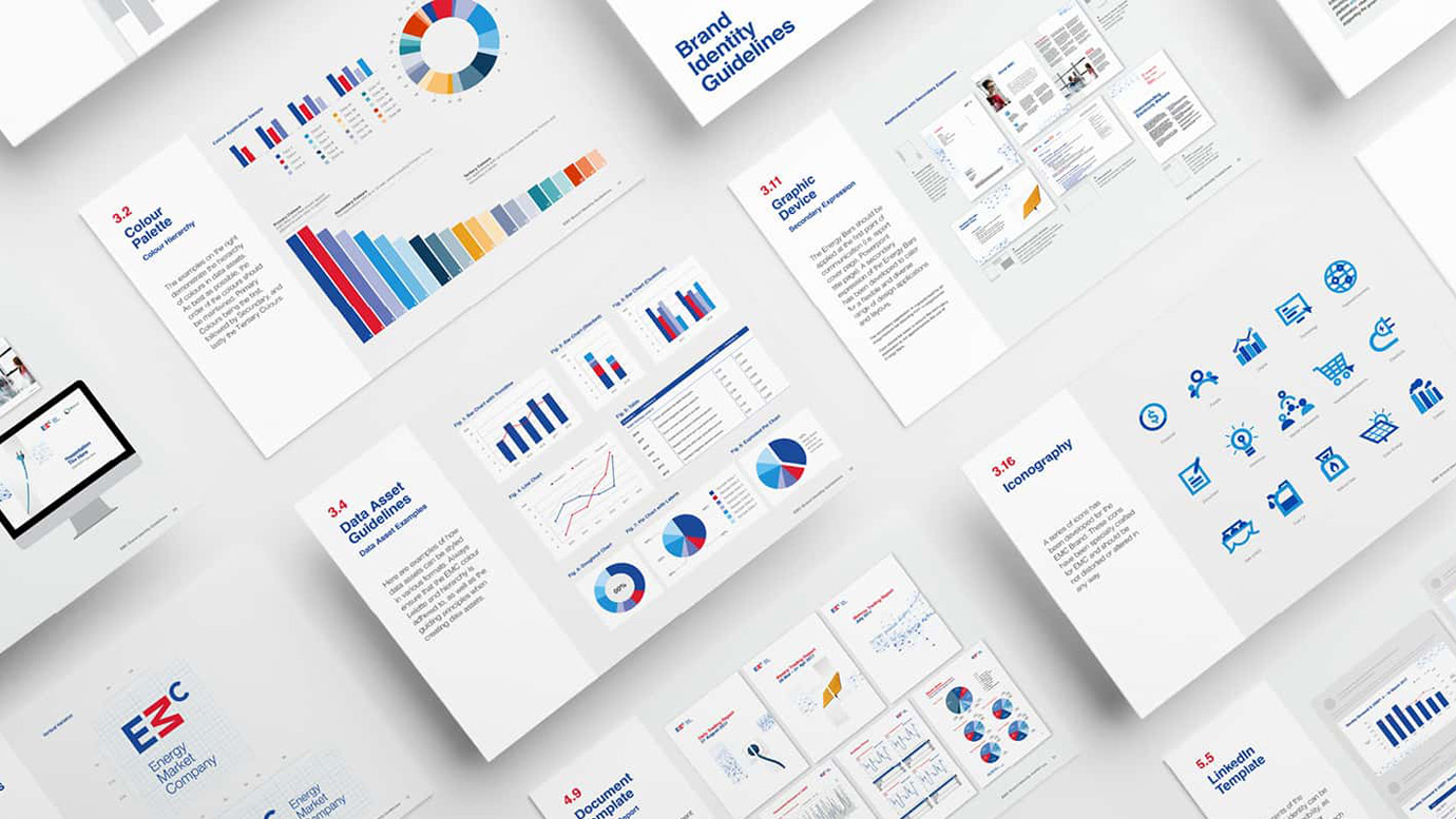
Any marketplace lives on data. To ensure EMC communicates its data consistently and clearly, we designed a comprehensive colour palette and a series of data assets along with a set of customised icons. We demonstrated how the Energy Bar device can be applied to different types of report covers to set them apart while coming from an authoritative source.
Digital assets
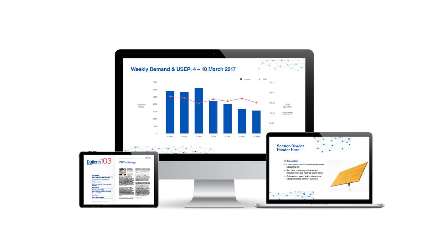
We had also created a system for digital reports, proposals and documents so that all the information published by EMC can be communicated in a clear and consistent manner. And finally, we brought EMC’s content up to date with a range of digital publishing applications, from e-newsletters and electronic direct mailers to presentation and social media templates.
Brand portfolio
Looking ahead to how the business was evolving into the future, we explored a range of brand architecture scenarios for the EMC brand portfolio.


